


At Big Fish Media we’ve just launched our new logo and thought it would be fun to share the process with all of you via a Blog post.
This is what our old logo looked like, we’d been using it for about two years:
![]()
The logo is simple and the colors are great. BUT, in recent months it was starting to feel…too simple = very plain. It needed a tag line or icon…something to hint at what we do. It also needed a certain “je ne sais quoi” to take it from looking like our name in colored font – to looking like a logo.
So we set out to find a graphic design agency to give us something new and fresh.
We spent a lot of time on Google, looking at portfolios and talking to designers on the phone/email. We wanted to work with a local company and needed to be very, very impressed with the designs in their portfolio.
Our search ended up branching into Moncton and Fredericton – where I found Creative Juices. Their portfolio is impressive and the designs have a very unique look.
Cory at Creative Juices was friendly, knowledgeable and great to talk to – I felt confident he would deliver the right logo for us.
So let’s get started!
The first step was a conversation about Big Fish Media, what we do, what we’re about, how we came up with our company name. We went through their portfolio of logos and I showed him what I liked and what I didn’t – in terms of style. We talked about a ‘fun/casual’ logo versus a ‘corporate’ logo.
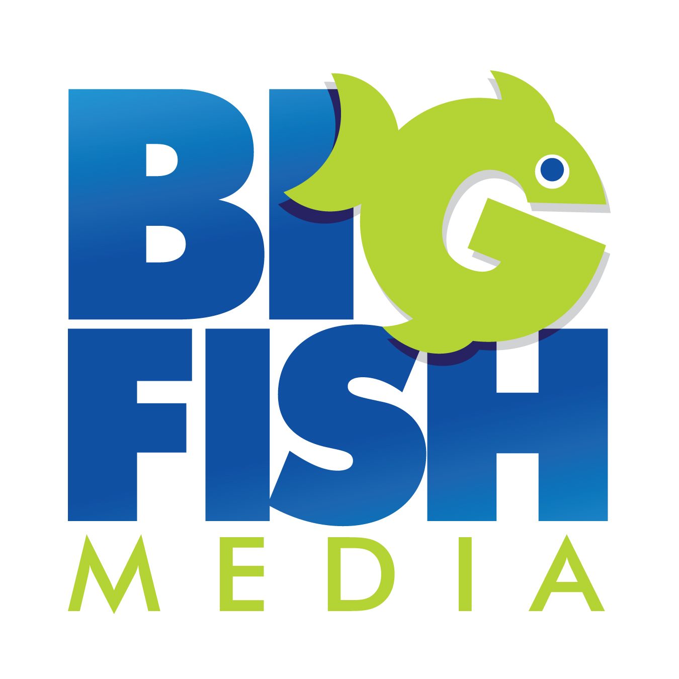
Big Fish Media is an Internet and Mobile Marketing agency…we help brands connect with consumers exactly where they are in this day and age – online and on their mobile phone.
Of course, with a company name like “Big Fish Media” we couldn’t avoid talking about the relevance of “Big Fish” to the name we chose. :)
“Big Fish Media” was birthed out of desire for a unique and memorable company name. There is also a positive connotation surrounding the phrase “Big Fish”, whether you ‘catch it’, ‘are it’ or ‘have it’, ‘Big Fish’ is a good thing. And, we were right – it is extremely catchy and memorable.
The next step was to create 8 – 10 logo concepts for us to consider. The designers at Creative Juices didn’t want specific direction for this (I understood the reasoning), but there were a few constraints: stick with our current colors of blue and lime green, a tag line (“Internet & Mobile Marketing”) and a style somewhere between ‘corporate’ and ‘fun’.
The tagline gave us more flexibility in the logo design because it so concisely summed up what we do and left little room for confusion.
So let’s talk about fish for a minute. Before even approaching a designer I gave a lot of thought to whether I’d want a fish in our logo. Discussed it with other people. I wasn’t really keen, because a fish has no relation to our product, but I knew the right tagline could eliminate any confusion.
It would also have to be the right fish…not a dolphin, shark, whale, salmon or trout. If there was going to be a fish I envisioned something round and ‘friendly'(?), like a blowfish.
Per the request for no ultra-specific direction I didn’t get into that with Cory and let him work his designer magic.
A few days later his team delivered 8 possible concepts. Here are a few…

From there we narrowed it down to the two with the “G” fish. I was surprised by how much I actually liked the fish element to our logo – it played on the name and gave it MORE meaning, rather than less.
We removed the bubbles…I liked them, especially in one of the other concepts where the bubbles were conversation bubbles…but, fish don’t breath through their mouth and I felt the logo looked a bit too busy.
Cory agreed and sent back another page of 8 versions of the two logos we liked. With and without the cool blue gradients in “Big Fish”, different font size and style in the tagline, increased the space between the “F” and the “I”. Now it was getting tough to choose! Horizontal or Vertical? Gradient or not? Which font?
So, I took a few days to think about it and get feedback from others and Cory made a great suggestion…if the color and font were identical we could have both versions and switch them up depending on the space requirement of the place they were being used.
ahhh, we can have both – that really helped!
By re-positioning the tagline in the horizontal version, this worked and our new logo was born!


Was very pleased to also hear the guys at Creative Juices say it’s one of their favorite logos.
To take a phrase often used by Michael Losier – “Say ‘YES’ if you like it!”
Comments are closed.